
Employee Monitoring Dashboard Best Practices: Customize for Actionable Insights
Most monitoring dashboards display data. Few drive decisions. The difference between a dashboard that sits open in a forgotten browser tab and one that shapes daily management decisions comes down to configuration: the right widgets, the right thresholds, and the right views for each role in the organization.
An employee monitoring dashboard is a visual interface that aggregates workforce activity data, including app usage, time allocation, idle patterns, and attendance records, into configurable widgets and real-time summaries for managers. Unlike static reports, a dashboard updates continuously and allows drill-down analysis. Organizations using well-configured monitoring dashboards make workforce decisions 40% faster than those relying on weekly report reviews (Deloitte, "Human Capital Trends," 2025). Yet a 2024 Forrester survey found that 67% of managers with access to monitoring dashboards never customize the default view, meaning they miss data relevant to their teams and see data they do not need. This guide covers the practical configuration decisions that turn a default monitoring dashboard into a management tool that drives daily action.
Why Default Monitoring Dashboard Configurations Fail
Every employee monitoring platform ships with a default dashboard layout. That default represents the vendor's best guess at what the average manager needs. The problem is that no manager is average. A BPO operations lead managing 200 agents across three shifts has fundamentally different dashboard requirements than a creative director overseeing a 12-person design team.
Default dashboards fail for three specific reasons. First, they show too many widgets. The average default monitoring dashboard displays 10 to 14 widgets, but research from the Nielsen Norman Group (2023) shows that dashboards with more than 10 elements produce 34% slower decision-making because users scan instead of analyze. Second, default dashboards lack role context. An executive who needs cost-per-hour trends sees individual keystroke intensity graphs. A team lead who needs individual timelines sees organization-wide aggregates. Third, alert thresholds on default dashboards use arbitrary values (e.g., "idle for 10 minutes") instead of baselines calculated from actual team behavior.
Customizing your employee monitoring dashboard is not optional if you want the data to drive decisions. It is the difference between monitoring and managing.
Core Metrics Every Monitoring Dashboard Needs
Employee monitoring dashboard customization starts with selecting the right metrics. Not every metric your platform offers belongs on your primary view. The goal is signal density: every widget on the screen should answer a question you ask daily.
But which metrics qualify? That depends on your role. The following five metrics form the foundation of an effective workforce analytics dashboard for most team managers. Executives and specialists need different selections, covered in the role-based section below.
1. Active Time vs. Idle Time Ratio
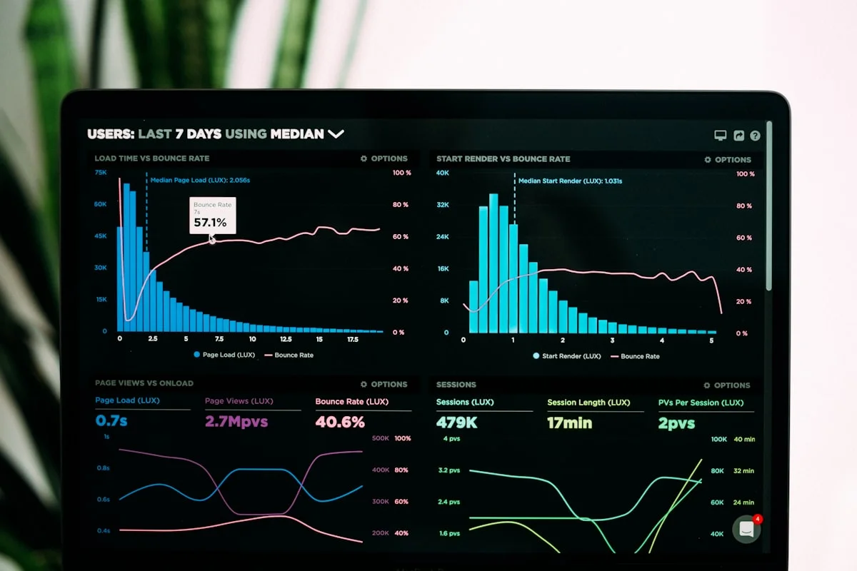
Active-to-idle ratio is the single most actionable metric on any employee monitoring dashboard. It answers: "How much of the paid workday involves actual work activity?" The American Payroll Association estimates that the average employee is productively active for 6 hours and 17 minutes out of an 8-hour workday. If your team's active ratio falls significantly below that benchmark, the dashboard immediately flags a pattern worth investigating.
eMonitor's active time widget displays a color-coded bar for each team member: green for active, yellow for idle, and gray for offline. This visual format lets managers spot outliers in seconds without reading numbers. A team with one yellow-heavy bar among nine green bars tells a clear story. Configure this widget to show today's data by default with a toggle for weekly trends.
2. Application and Website Usage Breakdown
Raw app usage data is noise. Classified app usage data is intelligence. An employee monitoring metrics dashboard that shows "Chrome: 4 hours" tells you nothing. A dashboard that shows "Chrome (productive research): 2.5 hours, Chrome (social media): 45 minutes, Chrome (internal tools): 45 minutes" tells you exactly how focus time is spent.
eMonitor's productivity classification engine labels every application and website as productive, non-productive, or neutral based on role-specific rules configured by the manager. The app usage widget on the monitoring dashboard displays these classifications as a stacked bar chart, making it simple to see productive-to-non-productive ratios across the team without inspecting individual logs.
3. Team and Individual Productivity Scores
Productivity scores aggregate multiple signals (active time, app classification, task completion) into a single numeric indicator per employee and per team. This metric answers: "Relative to their own baseline, how productive is this person or team today?"
The critical detail in productivity score configuration is baseline calibration. A productivity score is meaningless as an absolute number. An 82% score tells you nothing unless you know the employee's 30-day average is 85% (slight dip, probably fine) or 72% (significant improvement, worth recognizing). eMonitor calculates rolling 30-day baselines automatically and color-codes scores relative to each employee's own history, not a company-wide standard.
4. Attendance and Punctuality Rates
Attendance tracking on the monitoring dashboard goes beyond present-or-absent. Late arrivals, early departures, missed clock-ins, and shift compliance all contribute to a complete attendance picture. The International Labour Organization reports that unplanned absences cost employers an average of $3,600 per hourly employee per year (ILO, 2024).
Configure the attendance widget to display today's real-time status (present, absent, late, on leave) as a grid. Add a secondary trend line showing the team's punctuality rate over 14 days. This dual view gives you the immediate operational snapshot and the trend direction in one widget. eMonitor's attendance dashboard integrates with shift scheduling, so late arrivals are calculated relative to the employee's actual shift start time, not a blanket 9:00 AM assumption.
5. Alert Summary and Violation Feed
Alerts are the nervous system of a monitoring dashboard. They convert passive data into active prompts. Without a well-configured alert feed, a dashboard becomes a wall of charts that a manager must interpret. With alerts, the dashboard tells the manager what needs attention right now.
eMonitor's alert widget displays a chronological feed of triggered notifications: idle time violations, unauthorized app usage, overtime threshold warnings, attendance anomalies, and productivity drops. Each alert links directly to the relevant employee's detailed timeline for investigation. The most common configuration mistake is setting alert thresholds too aggressively, which generates a constant stream of low-signal notifications. Start with conservative thresholds and tighten over 30 days based on actual patterns.

Team Productivity — This Week
Productive hours / day
Activity mix
▲ Deep-focus time up 19% after protecting daily focus blocks.
Illustrative eMonitor dashboard.
How to Configure Monitoring Dashboards by Role
Core metrics form the foundation, but the most effective monitoring dashboard configuration varies by the viewer's management scope. A team lead managing eight direct reports needs granular, individual-level data. An executive managing four departments needs aggregate trends and cost analysis. Showing both audiences the same dashboard wastes one audience's time and overwhelms the other.
eMonitor supports role-based dashboard views through configurable widget permissions. Here is how to configure each role for maximum decision value.
Team Lead Dashboard Configuration
Team leads make micro-decisions: who needs support today, which tasks are falling behind, whether workloads are balanced across the team. Their monitoring dashboard configuration prioritizes individual-level visibility and daily patterns.
Recommended widgets (6 total):
- Individual activity timelines (color-coded hour-by-hour view of each team member's day)
- Active time vs. idle time bars per employee
- Today's productivity scores with baseline comparison
- Alert feed filtered to the team lead's direct reports only
- Attendance status grid (present, late, absent, on leave)
- Top apps by time spent for the team (aggregated)
Team leads benefit most from the timeline view because it answers the most frequent management question: "What is my team doing right now?" The timeline shows app transitions, break patterns, and focus blocks visually, so leads can identify when someone has been stuck (same app for 3 hours with declining activity) or context-switching excessively (15 app transitions per hour).
Department Head Dashboard Configuration
Department heads make meso-level decisions: staffing allocation, shift adjustments, cross-team resource balancing, and performance trend analysis. Their workforce analytics dashboard configuration prioritizes team-level aggregates and comparative metrics.
Recommended widgets (5 total):
- Team-level productivity scores (all teams side by side)
- Attendance trend over 14 days by team
- Active time distribution by department (productive, idle, offline percentages)
- Alert summary grouped by severity (critical, warning, informational)
- Overtime hours by team with cost impact
Department heads who configure their monitoring dashboards for team comparison consistently make better staffing decisions. MIT Sloan Management Review found that managers who focus on team-level patterns make 31% more accurate resource allocation decisions than those who focus on individual metrics (MIT Sloan, "People Analytics That Work," 2024).
Executive Dashboard Configuration
Executives need the monitoring dashboard to answer strategic questions: Is our workforce productive enough to meet revenue targets? Are we overstaffed or understaffed? Where are the biggest cost drains? Their dashboard configuration strips away individual data entirely and focuses on organizational KPIs.
Recommended widgets (4 total):
- Organization-wide productivity index with 90-day trend line
- Cost per productive hour (payroll divided by verified active hours)
- Department-level utilization rates
- Attrition risk summary (count of employees above risk threshold)
Fewer widgets, bigger decisions. Executives who see four high-quality metrics make faster strategic calls than those drowning in 12 widgets designed for operational managers. The executive monitoring dashboard is not about daily management. It is about quarterly planning backed by continuous data.
Setting Alert Thresholds That Reduce Noise
Alert configuration is the single most impactful decision in monitoring dashboard customization. Poorly configured alerts train managers to ignore the dashboard entirely. When every minor deviation triggers a notification, the genuinely important signals disappear into noise. Gartner's 2025 workforce management report found that 73% of managers who abandoned their monitoring dashboards cited "too many irrelevant alerts" as the primary reason.
How does an organization set alert thresholds that actually surface actionable anomalies without generating false positives? eMonitor uses a baseline-plus-deviation model that addresses this directly.
The Baseline-Plus-Deviation Method
Instead of setting arbitrary thresholds (e.g., "alert if idle for more than 15 minutes"), the baseline method calculates each metric's average and standard deviation over a 30-day rolling window. Alerts trigger when a metric deviates beyond a configurable percentage of the employee's or team's own baseline.
Example: If an employee's average daily productive time is 6.5 hours with a standard deviation of 0.4 hours, a 25% deviation threshold triggers an alert when productive time drops below 4.9 hours. This is a genuine anomaly worth investigating. A static 5-hour threshold would have either been too tight (triggering on normal variation) or too loose (missing meaningful drops) depending on the employee.
eMonitor calculates these baselines automatically for every employee and team metric. Managers configure only the deviation percentage. We recommend starting at 25% deviation for the first 30 days, then tightening to 15-20% once the system has established stable baselines for the team.
Five Alert Categories Worth Monitoring
Not all alerts carry equal operational weight. Configure your monitoring dashboard to prioritize these five categories in order of urgency.
- Compliance alerts (overtime approaching legal limits, missed break compliance, attendance violations): These carry financial and legal consequences. Set tight thresholds and route to both the manager and HR.
- Security alerts (unauthorized application access, USB device connections, file transfer violations): These protect company data. eMonitor's data loss prevention module feeds these alerts directly to IT and management dashboards simultaneously.
- Productivity anomalies (sudden drops below baseline, sustained idle periods, application category shifts): These indicate an employee who may need support, additional training, or workload adjustment.
- Attendance anomalies (late arrivals exceeding 3 per week, missed clock-ins, pattern changes): These often signal disengagement early, before productivity metrics decline.
- Burnout risk signals (sustained overtime, declining activity intensity despite long hours, reduced break frequency): These protect your people. eMonitor's attrition prediction model feeds burnout risk scores to the dashboard alert feed.
Each category serves a different management response. Compliance alerts demand immediate action. Burnout signals demand a conversation. Configuring your monitoring dashboard to label alerts by category helps managers respond appropriately instead of treating every notification with the same urgency.

Monitoring Dashboard Widget Selection and Layout Best Practices
Widget selection determines what information reaches the manager's eyes. Widget layout determines the order in which they process it. Both decisions directly affect decision speed and quality.
The Inverted-Pyramid Dashboard Layout
The most effective monitoring dashboard layout follows an inverted-pyramid structure borrowed from journalism. Place the most important, highest-level information at the top of the screen. Move to increasingly detailed data as the viewer scrolls down.
Top row: KPI summary cards (total active hours, team productivity score, alert count, attendance rate). These answer "How is the team doing right now?" in under 5 seconds.
Middle section: Team-level charts (productivity trend over 7 days, app usage distribution, active time heatmap by day and hour). These answer "Are there patterns I should investigate?"
Bottom section: Individual-level detail (employee timelines, individual alert histories, per-person productivity scores). These answer "What's happening with this specific person?"
This layout matches the natural decision flow. A manager opens the dashboard, sees the team summary, identifies an anomaly in the trend chart, and scrolls down to the individual data to investigate. No hunting, no switching between screens.
How Many Widgets Is Too Many?
Monitoring dashboards suffer from "metric creep" where stakeholders keep adding widgets until the dashboard is a wall of overlapping charts. Information density has diminishing returns. The Nielsen Norman Group's 2023 dashboard usability study measured task completion rates across 340 managers and found a clear threshold: dashboards with 5 to 8 widgets produced the fastest, most accurate decisions. Dashboards with 9 to 12 widgets showed 18% slower decision times. Dashboards with 13 or more widgets showed 34% slower decision times plus a 22% increase in incorrect conclusions.
eMonitor defaults to 6 widgets on new dashboard views and warns when a user adds more than 8. The constraint is intentional. A dashboard that shows everything shows nothing, because human attention is the bottleneck, not data availability.
Choosing the Right Visualization Type
Matching data to the correct visualization type accelerates comprehension. The wrong chart type forces the viewer to decode information rather than absorb it.
- Heatmaps for time-based patterns: Use heatmaps to show activity intensity by hour and day. eMonitor's visual heatmaps color-code productive, idle, and away time across the work week, revealing patterns invisible in tables.
- Stacked bar charts for composition data: App usage breakdowns, productive vs. non-productive splits, and time allocation categories work best as stacked bars that show parts of a whole.
- Line charts for trend data: Productivity score trends, attendance rates over time, and overtime accumulation all require line charts to show direction and velocity of change.
- Status grids for real-time operational data: Current attendance (present, absent, late) and live activity status (active, idle, offline) belong in grid format where color coding replaces numeric values.
- Single-number KPI cards for headline metrics: Team productivity score, total active hours, and alert count read fastest as single large numbers with a delta indicator showing change from yesterday.
How Often Managers Should Check Monitoring Dashboards
Access frequency is a overlooked dimension of employee monitoring dashboard best practices. The instinct is to check constantly, especially during the first weeks of deployment. That instinct leads to micromanagement, decision fatigue, and diminished trust between managers and teams.
Research from Harvard Business Review (2024) found that managers who check monitoring dashboards more than 6 times per day spend 23% more time on oversight activities and 18% less time on coaching, strategy, and team development. The data becomes a distraction rather than a tool.
The Two-Review Daily Rhythm
The most productive monitoring dashboard review cadence involves two structured check-ins per day.
Morning review (15 minutes): Open the dashboard at the start of the workday. Check overnight alerts, review yesterday's final productivity scores, and note any attendance anomalies for today. This sets the manager's agenda: who might need support, which tasks are at risk, whether coverage is adequate for the day's priorities.
Afternoon review (10 minutes): Check the dashboard around 2:00-3:00 PM. Review today's productivity trends against baseline, check for any triggered alerts, and assess whether active time ratios suggest the team is on track to meet daily targets. This is the window for same-day intervention if something is going wrong.
Outside these two windows, rely on push alerts for urgent matters. eMonitor sends real-time notifications for critical alerts (compliance violations, security events, overtime threshold breaches) via email or desktop notification, so managers do not need the dashboard open to catch high-priority issues.
Weekly Deep-Dive Analysis
Daily dashboard reviews catch operational issues. Weekly deep dives surface trends. Set aside 30 minutes each Friday to review the weekly trend data: productivity score trajectory, overtime accumulation, alert frequency patterns, and attendance trends.
This weekly review is where managers identify systemic issues that daily check-ins miss. A gradual 3% productivity decline over four weeks does not trigger daily alerts, but it is visible in a 30-day trend chart. A shift from productive-app usage to communication-app usage over two weeks might signal a project transition or a team that is stuck in meeting overload. eMonitor's reporting dashboards generate automated weekly summaries that highlight these patterns.
Employee-Facing Dashboard Configuration
Employee monitoring dashboards are not exclusively management tools. Giving employees access to their own data is one of the most effective configurations for building trust and driving self-directed improvement.
Harvard Business Review's 2024 study on transparent monitoring found that teams with employee-visible dashboards showed 14% higher sustained productivity over 12 months compared to teams where only managers saw the data. The mechanism is self-awareness: when employees see their own activity patterns, idle time gaps, and productivity scores, they self-correct without manager intervention.
What Employees Should See on Their Dashboard
Employee-facing monitoring dashboards require careful widget selection. Show data that helps the employee improve. Hide data that creates anxiety without providing actionable context.
- Personal productivity score with 7-day trend: Lets employees track their own improvement arc without comparing to peers
- Time allocation breakdown (productive, neutral, non-productive percentages): Helps employees identify where focus time is lost to low-value activities
- Active time summary with break periods highlighted: Gives employees an honest picture of their work rhythm and encourages healthy break habits
- Focus time blocks (uninterrupted periods of 45+ minutes on productive apps): Celebrates deep work and helps employees protect it
eMonitor's employee-facing dashboard excludes screenshot galleries, keystroke intensity data, and comparison rankings against peers. These elements create anxiety and resentment without providing the employee with actionable improvement paths. The employee dashboard is a mirror, not a report card.
Why Transparent Dashboards Build Trust
Organizations that deploy employee monitoring without any employee-facing visibility create an information asymmetry: management knows everything about the employee's work patterns, but the employee knows nothing about what is being measured or how. This asymmetry breeds distrust and resentment, even when monitoring policies are fair.
Transparent monitoring dashboards eliminate this asymmetry. When employees see exactly what data their manager sees (minus peer comparisons and management-only analytics), monitoring becomes a shared productivity tool rather than a one-directional observation system. eMonitor was designed with this principle from the start: configurable monitoring levels, employee-visible data, and privacy boundaries that respect personal time.
Seven Common Monitoring Dashboard Configuration Mistakes
After working with 1,000+ organizations configuring their employee monitoring dashboards, we see the same configuration mistakes repeatedly. Avoiding these errors saves weeks of dashboard fatigue and prevents the "abandoned dashboard" problem where managers stop checking within 60 days.
- Using vendor defaults permanently. Default dashboards serve no one well. Within the first week of deployment, every manager should customize widget selection, layout, and alert thresholds for their team.
- Setting alert thresholds too aggressively. New administrators often set idle alerts at 5 minutes and productivity thresholds at 90%. This floods the alert feed with false positives, training managers to ignore all notifications. Start at 25% deviation from baseline.
- Ignoring baseline calibration periods. Alert baselines need 30 days of data to stabilize. During the first month, treat alert data as informational, not actionable. Make configuration decisions after the baseline period.
- Displaying individual data on executive dashboards. Executives do not need to see individual employee timelines. Showing granular data to senior leadership encourages micromanagement and undermines the management chain. Configure executive views with department-level aggregates only.
- Neglecting employee-facing dashboards. Manager-only dashboards create information asymmetry and erode trust. Configuring employee-visible productivity data turns monitoring from a control mechanism into a development tool.
- Adding widgets without removing them. Dashboard metric creep is real. Every time a stakeholder requests a new widget, remove one. Maintain the 5 to 8 widget guideline by forcing trade-offs.
- Checking the dashboard too frequently. Constant dashboard monitoring is micromanagement with a screen between you and the employee. Structured daily reviews (morning and afternoon) produce better outcomes than continuous monitoring of the monitoring tool.
Advanced Monitoring Dashboard Configuration Techniques
Once the fundamentals are in place (role-based views, calibrated thresholds, appropriate widget count), advanced configuration techniques extract additional value from your workforce analytics dashboard.
Conditional Widget Visibility
Not every widget needs to be visible every day. eMonitor supports conditional display rules that show or hide widgets based on data conditions. For example, an overtime tracking widget can appear only when any team member exceeds 35 hours in the current week. A burnout risk widget can surface only when the attrition prediction model scores someone above the alert threshold.
Conditional visibility keeps the dashboard clean during normal operations and surfaces relevant widgets precisely when they are needed. This approach reduces visual clutter by an estimated 30-40% on a typical day while ensuring no critical information is missed.
Team-vs-Team and Period-vs-Period Benchmarks
Comparative widgets add context that standalone metrics lack. A team productivity score of 78% means little in isolation. A score of 78% compared to last month's 82% and the department average of 75% tells a complete story: the team is above average but trending downward.
Configure comparison widgets to show current-period vs. previous-period (week-over-week or month-over-month) and team vs. department average. eMonitor calculates these comparisons automatically when the comparison widget is added to the dashboard.
Dashboard-to-Report Automation
The monitoring dashboard serves real-time decision-making. But stakeholders who do not access the dashboard (HR directors, finance teams, C-suite) still need regular workforce data. eMonitor's automated report scheduling generates PDF or CSV summaries from dashboard data on a daily, weekly, or monthly cadence and delivers them via email.
Configure weekly reports for department heads and monthly reports for executives. Include only the metrics visible on their configured dashboard view. This ensures the report matches the dashboard, creating consistency between real-time and periodic analysis.
Dashboard Configuration Implementation Checklist
For teams deploying eMonitor or reconfiguring an existing employee monitoring dashboard, this checklist covers the implementation sequence from day one through the first 90 days.
Week 1: Foundation setup
- Define role-based views (team lead, department head, executive, employee)
- Select 5 to 8 widgets per role using the recommendations above
- Set initial alert thresholds at 25% deviation from industry benchmarks
- Configure employee-facing dashboards with personal productivity data
- Communicate dashboard access and monitoring policy to all employees
Weeks 2 to 4: Baseline calibration
- Allow 30 days for baselines to stabilize across all metrics
- Document alert patterns (how many per day, which categories, false positive rate)
- Gather manager feedback on widget usefulness and layout preferences
- Identify metrics that generate no management action (candidates for removal)
Weeks 5 to 8: Optimization
- Tighten alert thresholds to 15 to 20% deviation based on actual team baselines
- Remove unused widgets and replace with higher-value alternatives
- Configure conditional widget visibility for overtime and risk indicators
- Add comparison benchmarks (period-over-period, team-vs-department)
Weeks 9 to 12: Automation and scaling
- Set up automated weekly and monthly report delivery
- Create saved dashboard configurations as templates for new managers
- Review alert-to-action conversion rate (what percentage of alerts resulted in a management action?)
- Adjust cadence: confirm the two-review daily rhythm works or modify based on team feedback
Frequently Asked Questions About Employee Monitoring Dashboards
What metrics should be on a monitoring dashboard?
An employee monitoring dashboard displays five core metrics: active time vs. idle time ratios, application and website usage breakdowns, productivity scores by team and individual, attendance and punctuality rates, and alert summaries for policy violations. eMonitor organizes these into configurable widgets that managers arrange by priority.
How do you customize monitoring dashboards by role?
eMonitor supports role-based dashboard views through configurable widget permissions. Team leads see individual activity timelines and productivity scores. Department heads see team-level aggregates and trend comparisons. Executives see organization-wide KPIs and cost metrics. Each role accesses only the data relevant to their management scope.
What alerts should monitoring dashboards show?
Monitoring dashboard alerts cover five categories: idle time exceeding configured thresholds, unauthorized application or website access, overtime approaching regulatory limits, attendance anomalies like missed clock-ins, and productivity drops below team baselines. eMonitor allows custom alert rules per team so thresholds match actual work patterns.
How often should managers check monitoring dashboards?
Managers who check monitoring dashboards in structured intervals produce better outcomes than those who check constantly. A 15-minute morning review of overnight alerts and a 10-minute afternoon check of daily productivity trends is sufficient. Gartner research shows that over-monitoring reduces manager effectiveness by 22% due to context switching.
What is the difference between a monitoring dashboard and a report?
An employee monitoring dashboard displays real-time and near-real-time data through visual widgets updated continuously. Reports are static snapshots generated for a specific time period. Dashboards support immediate operational decisions; reports support retrospective analysis. eMonitor provides both through its reporting and dashboards feature.
How many widgets should a monitoring dashboard have?
Effective monitoring dashboards contain 5 to 8 widgets. Research from the Nielsen Norman Group shows that dashboards with more than 10 widgets produce 34% slower decision-making because users spend time scanning instead of analyzing. eMonitor defaults to 6 widgets and allows managers to add or remove based on their priorities.
Can employees see their own monitoring dashboard?
eMonitor provides employee-facing dashboards showing individual productivity scores, time allocation breakdowns, and focus time metrics. Transparency drives self-correction: teams with employee-visible dashboards show 14% higher sustained productivity than teams with manager-only dashboards, according to Harvard Business Review research from 2024.
What is a workforce analytics dashboard?
A workforce analytics dashboard is a visual interface that aggregates employee activity data into productivity metrics, attendance patterns, and behavioral trends. Unlike basic monitoring dashboards that show raw data, workforce analytics dashboards apply classification algorithms and trend analysis to surface actionable patterns across teams and time periods.
How do you set alert thresholds on a monitoring dashboard?
eMonitor's alert threshold configuration follows a baseline-plus-deviation model. The system calculates each team's average metrics over 30 days, then triggers alerts when activity deviates beyond a configurable percentage. Starting at 25% deviation catches genuine anomalies without generating false positives from normal daily variation.
Should monitoring dashboards show individual or team data?
Monitoring dashboards produce the best outcomes when they default to team-level aggregates and allow drill-down to individual data only when anomalies appear. MIT Sloan Management Review found that managers who focus on team patterns make 31% better staffing decisions than those who focus on individual metrics. eMonitor supports both views.
What is the best layout for an employee monitoring dashboard?
The most effective monitoring dashboard layout follows an inverted-pyramid structure: high-level KPIs and alerts at the top, team-level breakdowns in the middle, and detailed individual timelines at the bottom. This layout matches the natural decision flow from strategic overview to tactical detail. eMonitor's default layout follows this pattern.
How do monitoring dashboard widgets affect page load time?
Each monitoring dashboard widget adds a data query to the page load. eMonitor loads widgets asynchronously, so the core dashboard appears within 2 seconds regardless of widget count. Historical trend widgets with 90-day data ranges load slower than real-time widgets. Limiting historical widgets to 30-day defaults maintains sub-3-second total load times.
Sources
- Deloitte, "Human Capital Trends," 2025
- Forrester, "Workforce Analytics Adoption Survey," 2024
- Nielsen Norman Group, "Dashboard Usability Study," 2023
- American Payroll Association, "Workforce Time and Attendance Report," 2024
- International Labour Organization, "Absenteeism Cost Report," 2024
- MIT Sloan Management Review, "People Analytics That Work," 2024
- Harvard Business Review, "Transparent Monitoring and Employee Productivity," 2024
- Gartner, "Workforce Management Technology Survey," 2025
Conclusion: Monitoring Dashboard Configuration as a Management Practice
An employee monitoring dashboard is only as valuable as its configuration. The technology captures the data. Widget selection, role-based views, calibrated alert thresholds, and structured review cadences determine whether that data drives decisions or gathers digital dust.
The best practices in this guide, from the inverted-pyramid layout to the baseline-plus-deviation alert method to the two-review daily rhythm, are not theoretical. They come from patterns observed across 1,000+ organizations using eMonitor to manage distributed, hybrid, and in-office teams. Start with the five core widgets. Calibrate your baselines over 30 days. Resist the urge to add more metrics, and trust that fewer, better-configured widgets produce faster, more accurate management decisions.
The organizations that get the most value from employee monitoring dashboards are not the ones with the most data. They are the ones that configured their dashboards to show only the data that prompts action.

See What Your Team’s Workday Really Looks Like
eMonitor turns activity, time, and productivity data into clear insights — transparently, in one platform.