
Employee Monitoring Reports That Actually Matter: A Manager's Weekly Review Guide
Employee monitoring reports give managers a structured view of team activity, productivity patterns, and time allocation across projects and applications. The problem is not a lack of data. Most monitoring platforms generate dozens of reports, dashboards, and alerts. The real challenge is knowing which employee monitoring reports managers should review weekly, how to interpret the numbers correctly, and what actions to take without slipping into micromanagement.
Why a Weekly Cadence for Employee Monitoring Reports Is the Right Default
Employee monitoring report review follows a weekly cadence for most management needs, and research backs this up. A daily review habit creates two problems: data overload and reactionary management. When managers look at monitoring data every morning, they start responding to single-day fluctuations that have no statistical significance. One developer spending three hours on YouTube on a Tuesday could be watching a conference talk for a current project. Without the full week's context, that data point looks like a performance problem.
But how does a weekly rhythm prevent the overreaction that daily data checks encourage?
Weekly aggregation smooths out the noise. A seven-day window captures the natural rhythm of knowledge work: Monday planning, Tuesday-Wednesday deep work, Thursday meetings, Friday wrap-up. Reviewing these patterns as a weekly summary gives managers a signal they can act on. The American Management Association found that managers who reviewed workforce data weekly instead of daily made 41% fewer false-positive performance interventions and reported higher team satisfaction scores (AMA Workforce Analytics Report, 2024).
Monthly reviews, by contrast, arrive too late. If a team member struggles for three weeks before a manager notices, the window for early intervention has closed. Weekly review hits the balance: enough data to identify real trends, frequent enough to catch problems before they compound.
The Exception: When Daily Data Checks Make Sense
Daily monitoring review is appropriate in exactly two scenarios. First, during the initial two-week rollout of a monitoring platform, managers should review data daily to validate that productivity classifications are accurate and that the system is capturing activity correctly. Second, during time-sensitive project sprints with hard deadlines, daily check-ins on project-level time allocation help managers reallocate resources before bottlenecks cause delays. Outside these situations, weekly review is the default.
The Five Employee Monitoring Reports Every Manager Needs Weekly
Not every report in your monitoring platform deserves weekly attention. After analyzing report usage patterns across 1,000+ companies using eMonitor, we identified five reports that consistently drive the most useful management decisions. Here they are, ranked by impact.
1. Team Productivity Summary Report
The team productivity summary is the single most important employee monitoring report for weekly review. This report aggregates productive, non-productive, and neutral application usage across your entire team for the past seven days. It answers one question: is my team spending their time on work that aligns with their roles?
A healthy team productivity average for knowledge workers sits between 65% and 85% (Gartner Workforce Analytics Benchmark, 2025). Scores consistently below 60% warrant a closer look at individual breakdowns. Scores above 90% often signal that productivity classification rules are too broad, labeling almost everything as "productive" and rendering the metric meaningless.
What to look for: week-over-week trend direction, not the absolute number. A team averaging 72% productivity that drops to 64% over two consecutive weeks is a stronger signal than a team that consistently averages 68%.
2. Application and Website Usage Breakdown
The application usage report shows which tools your team spends the most time in, ranked by total hours. This report reveals workflow patterns that productivity scores alone cannot capture. If a development team spends 35% of its time in Jira and Slack but only 40% in their IDE, meeting overhead and project management friction may be consuming too much productive capacity.
Review this report with role-specific context. A designer spending four hours daily in Figma is performing as expected. A project manager spending four hours daily in Figma is not. Application usage data becomes meaningful only when filtered through the lens of what each role is supposed to be doing.
3. Time Allocation by Project Report
For teams working across multiple clients or projects, the time allocation report is essential for budget management and resource planning. This report shows how many hours each team member logged against each active project over the past week.
The most common insight from this report: scope creep. When a project budgeted for 200 hours starts consuming 15% more time each week, the time allocation report catches it before the budget is exhausted. Agencies and professional services firms using automated time allocation reports recover an average of 15-20% more billable hours than teams using manual time entry (Mavenlink Resource Management Survey, 2024).
4. Attendance and Punctuality Trends
Attendance monitoring reports track clock-in times, clock-out times, total hours worked, and pattern deviations across the week. This report matters most for shift-based teams and organizations with core-hours policies.
The attendance trend to watch is not who arrived five minutes late on Wednesday. It is who has shifted their start time later by 20+ minutes consistently over three weeks. Gradual schedule drift often correlates with declining engagement, and catching it early gives managers the opportunity to have a supportive conversation before it becomes a performance issue.
5. Idle Time and Activity Gap Patterns
Idle time reports measure periods where no keyboard or mouse activity is detected on a monitored device. This report is the most commonly misinterpreted metric in employee monitoring, which is precisely why it deserves weekly attention from informed managers rather than being left to automated alerts.
Healthy idle time for a knowledge worker ranges from 15% to 25% of total tracked hours. This accounts for thinking, phone calls, whiteboard sessions, and the natural micro-breaks that sustain focus over an eight-hour day. Idle time below 10% is more concerning than idle time at 20%, because it often indicates a system that counts meetings and phone calls as "idle" due to no keyboard input.
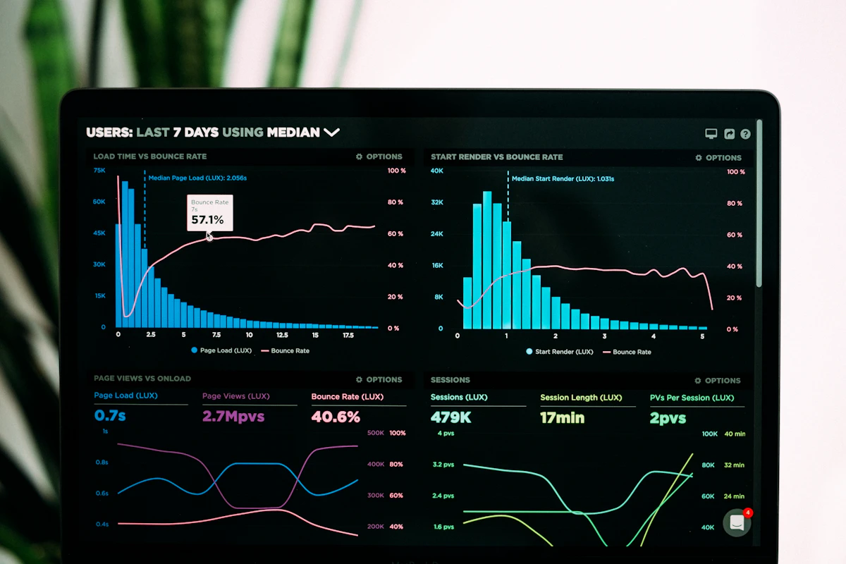
Team Productivity — This Week
Productive hours / day
Activity mix
▲ Deep-focus time up 19% after protecting daily focus blocks.
Illustrative eMonitor dashboard.
How to Interpret Employee Monitoring Data Without Misreading the Numbers
Employee monitoring data interpretation is where most managers make their costliest mistakes. Raw data is descriptive, not prescriptive. A number tells you what happened. It does not tell you why, and it definitely does not tell you what to do about it. Here are the four most common misinterpretation traps and how to avoid each one.
Trap 1: Confusing Presence With Productivity
Hours logged is not productivity. An employee who works 50 hours with a 58% productivity score is less effective than an employee who works 40 hours at 82% productivity. The first employee is present for longer but producing less focused output per hour. Monitoring reports that emphasize hours worked over productivity density create a culture that rewards face time over results.
The better metric is productive hours per day, calculated as (total hours tracked) x (productivity score). An employee working 8 hours at 75% productivity delivers 6 productive hours. An employee working 10 hours at 55% delivers 5.5 productive hours. The shorter workday is the more effective one.
Trap 2: Comparing Individuals Instead of Tracking Personal Baselines
Comparing one employee's productivity score against another's is misleading because different roles produce different score profiles. A customer support agent who spends 85% of their day in a ticketing system will naturally score higher than a strategist who splits time between research, writing, and internal discussions.
The correct comparison is each employee against their own 30-day rolling average. When someone deviates more than 15% from their personal baseline for two consecutive weeks, that deviation is statistically significant and worth a conversation. Comparing across individuals leads to unfair evaluations and erodes trust in the monitoring system.
Trap 3: Reacting to Single-Day Data Points
A single day of low productivity is noise, not signal. Every professional has days consumed by unexpected meetings, administrative tasks, or personal matters that reduce focused work time. Responding to one bad day with a performance conversation damages the manager-employee relationship and teaches employees to game the system rather than do their best work.
Minimum observation window: two consecutive weeks of deviation from baseline before any intervention. This threshold eliminates false positives from sick days, meeting-heavy weeks, and the natural ebb and flow of project cycles.
Trap 4: Ignoring the Classification Configuration
Productivity scores are only as accurate as the rules that generate them. If your monitoring platform classifies YouTube as "non-productive" for every role, your learning and development team will always appear unproductive because they consume video training content as part of their job. Before drawing any conclusions from productivity data, verify that the classification rules match the actual tool requirements of each role.
Schedule a quarterly classification review. Pull the top 20 applications by usage time, confirm each one is categorized correctly for each department, and adjust. This 30-minute quarterly exercise prevents months of bad data from distorting management decisions.
The Weekly Review Action Framework for Employee Monitoring Reports
Knowing which reports to review and how to interpret them is only half the job. The other half is a repeatable decision framework that converts data into management actions. Here is a step-by-step process designed for a 30-minute weekly review session.
Step 1: Pull the Five Core Reports (5 Minutes)
Open your monitoring dashboard and pull the five reports listed above for the past seven days. Most platforms, including eMonitor, allow you to save this view as a custom dashboard so the reports load automatically. No time wasted navigating between screens each week.
Step 2: Scan for Deviations From Baseline (10 Minutes)
For each report, compare this week's numbers to the team's 30-day rolling average. Flag any metric that deviates by more than 15% in either direction. A 15% threshold filters out normal variation while catching meaningful shifts early.
Use a simple three-column note: Metric | Direction (up/down) | Magnitude. If no metrics breach the 15% threshold, your team is performing within normal range. Close the dashboard and move on with your week.
Step 3: Investigate Flagged Deviations (10 Minutes)
For any flagged metric, drill down one level. If team productivity dropped 18%, check which individual(s) drove the decline. If idle time spiked for one person, check whether it correlates with a calendar event (offsite, training, personal leave). Context turns a data flag into either a false alarm or a genuine insight.
Critical rule: never investigate more than three flags per session. If your dashboard shows ten deviations in a single week, the likely cause is a system-level event (holiday week, tool outage, company meeting day), not ten individual performance problems. Check for system-level explanations first.
Step 4: Classify Each Genuine Deviation (3 Minutes)
For each deviation that survives investigation, classify it into one of three categories:
- Support needed: the employee may be struggling with workload, a new tool, or personal circumstances. Action: schedule a one-on-one check-in with an open-ended question ("How is the project going? Anything blocking you?").
- Process issue: the deviation reflects a workflow problem, not an individual problem. Action: adjust the process (redistribute work, reduce meeting load, fix a tooling issue).
- Positive signal: someone is performing above baseline. Action: recognize the contribution in your next team sync. Recognition based on data is more credible than vague praise.
Step 5: Document and Close (2 Minutes)
Record your findings and planned actions in a running document. This log serves two purposes: it creates a historical record for performance reviews, and it forces accountability on follow-through. If you flagged something last week, check whether this week's data shows improvement before flagging it again.

Get Reports That Drive Decisions, Not Data Overload
eMonitor gives managers pre-built weekly summary dashboards, role-specific productivity classifications, and trend alerts that surface only what matters. Trusted by 1,000+ companies.
Weekly Monitoring Report Template for Managers
A standardized template keeps your weekly review consistent and prevents the common problem of reviewing different metrics each week depending on what catches your eye. Here is a practical template you can adapt to your team.
| Report Section | What to Record | Threshold for Action |
|---|---|---|
| Team productivity average | This week's % vs. 30-day average | Deviation greater than 15% in either direction |
| Top 5 apps by hours | Application names and hours spent | New app in top 5, or known app drops out |
| Project time allocation | Hours per project vs. budgeted hours | Any project exceeding 110% of weekly budget |
| Attendance highlights | Late arrivals, early departures, missed days | Same individual flagged 3+ times in 2 weeks |
| Idle time average | Team average % and individual outliers | Individual above 35% or below 8% |
| Overtime hours | Total team overtime and individual leaders | Any individual exceeding 5 overtime hours/week for 2+ consecutive weeks |
| Trend direction | Improving, stable, or declining vs. last week | Declining for 3+ consecutive weeks |
This template takes approximately five minutes to fill out and provides a snapshot that is useful for your own reference, for executive reporting, and for performance review documentation. The key discipline: fill it out the same way every week so comparisons over time are valid.
Seven Common Mistakes Managers Make With Employee Monitoring Reports
Even experienced managers fall into reporting traps that undermine the value of monitoring data. These seven mistakes appear repeatedly across organizations of every size, and each one has a straightforward fix.
Mistake 1: Reviewing Reports Without a Predetermined Threshold
Managers who open monitoring dashboards without predefined thresholds will always find something that "looks off." The human brain is wired to spot anomalies, and a monitoring dashboard is full of variation. Without a threshold (e.g., 15% deviation from baseline), every dip and spike triggers concern. Set your thresholds before you open the dashboard, not after.
Mistake 2: Using Monitoring Data in Disciplinary Conversations First
When the first time an employee hears about monitoring data is during a disciplinary meeting, trust evaporates. A 2024 Edelman Trust Barometer survey found that 73% of employees who learned about monitoring through a negative interaction reported lower trust in their employer. The fix: share team-level reports in regular team meetings so employees see the data as a normal management tool, not a weapon held in reserve.
Mistake 3: Tracking Too Many Metrics Simultaneously
Dashboards can display hundreds of data points. Reviewing all of them is impossible and unnecessary. Research from MIT Sloan Management Review (2023) found that managers tracking more than seven metrics simultaneously made 34% slower decisions and reported lower confidence in those decisions. The five-report framework above is intentionally constrained to prevent information paralysis.
Mistake 4: Ignoring Seasonal and Cyclical Patterns
Productivity drops during holiday weeks, fiscal quarter ends, and annual planning periods. These drops are systemic, not individual. A manager who flags employees for low productivity during the week between Christmas and New Year's is measuring seasonal effects, not performance. Annotate your weekly logs with known events so you can distinguish systemic dips from genuine problems.
Mistake 5: Not Configuring Role-Specific Productivity Rules
Default productivity classifications treat every application the same way for every role. This creates inaccurate data from day one. Slack might be a core productivity tool for a customer success team and a distraction source for a development team during sprint weeks. Configure classifications per department or role during initial setup, and review them quarterly.
Mistake 6: Failing to Act on Positive Signals
Most managers review monitoring data looking for problems. High performers who consistently exceed baselines receive no recognition from the data, because the manager is not looking for positives. This is a missed opportunity. Data-backed recognition ("I noticed your focus time increased by 20% this quarter, and your project delivery rate improved along with it") is specific, credible, and motivating.
Mistake 7: Keeping Monitoring Reports Siloed to Management
When only managers see the data, employees have no opportunity to self-correct. Platforms like eMonitor provide employee-facing dashboards where individuals can view their own activity patterns, productivity trends, and time allocation. A Harvard Business Review study (2024) found that teams with access to their own productivity data improved output by 12% over six months compared to teams where only managers could see the data. Transparency turns monitoring from oversight into a self-improvement tool.

Using Employee Monitoring Reports to Detect Burnout Before It Costs You
Employee monitoring reports serve as an early warning system for burnout when managers know which patterns to watch. A 2025 Gallup workplace study found that 76% of employees experiencing burnout showed detectable changes in their digital work patterns two to four weeks before a measurable performance decline. Monitoring reports can surface these patterns if you know where to look.
The Four Burnout Warning Signals in Monitoring Data
- Consistently exceeding scheduled hours: an employee regularly logging 9.5+ hours when their schedule calls for 8 is compensating for declining efficiency or carrying too much work. The total hours metric in attendance reports catches this.
- Rising idle time during core hours: idle time that increases gradually over three or more weeks, particularly during the employee's historically most productive hours (usually mid-morning), indicates cognitive fatigue or disengagement.
- Declining application diversity: a team member who used to split time across five project-related tools but now spends 80%+ of their day in email and messaging apps may be stuck in reactive mode, unable to progress on deeper work.
- Shrinking break frequency: counterintuitively, employees approaching burnout often take fewer breaks, not more. They push through fatigue without recovery periods, accelerating the burnout cycle. Break frequency data from attendance reports reveals this pattern.
When you spot two or more of these signals for the same employee over a two-week period, schedule a private, supportive conversation. Frame it around workload and support, not performance. "I noticed you have been working later than usual. Is there anything I can take off your plate, or anything blocking your workflow?" is a response that builds trust and addresses the root cause.
Rolling Up Monitoring Data for Executive-Level Reports
Executives do not need the same level of detail as frontline managers. An executive summary drawn from employee monitoring reports distills team-level data into three numbers and one recommendation.
The Three Executive Metrics
- Team utilization rate: the percentage of tracked hours spent on productive applications, aggregated across all teams. This single number tells an executive whether the organization's workforce is engaged and aligned with business priorities. Industry benchmark: 70-80% for knowledge-work organizations (McKinsey Global Institute, 2025).
- Project time allocation vs. budget: hours spent per project compared to budgeted hours, expressed as a percentage. Any project consuming more than 115% of its budget deserves executive visibility. This metric drives decisions about resource reallocation and project prioritization.
- Trend direction: a simple three-word assessment: improving, stable, or declining. Executives care about trajectory more than absolute numbers. A team that improved from 65% to 72% utilization over the past quarter is a stronger story than a team that sat flat at 75%.
Format this as a one-page summary with a single recommendation at the bottom: "Increase headcount on Project X," "Reduce meeting load for Engineering," or "No changes recommended." Executives act on clear recommendations, not data dumps.
Balancing Monitoring Depth With Employee Privacy
Employee monitoring reports generate value only when employees trust the system that produces them. Overmonitoring, or the perception of it, destroys that trust and makes the data less reliable because employees start gaming the metrics instead of working naturally.
But how does a manager use detailed monitoring data without crossing privacy boundaries that damage team trust?
Three principles protect the balance. First, monitor during work hours only. eMonitor tracks activity only when employees are clocked in, with no after-hours data collection. This boundary is non-negotiable for employee trust. Second, share what you track. Publish a clear monitoring policy that lists exactly which data points are collected, who can access them, and how they are used. Ambiguity breeds suspicion. Third, give employees access to their own data. When employees can see the same dashboards managers see (at the individual level), monitoring shifts from "they are watching me" to "I can see my own work patterns." eMonitor's employee-facing dashboard supports this transparency.
Organizations that implement transparent monitoring policies report 23% higher employee acceptance rates than those that deploy monitoring without clear communication (SHRM Workplace Technology Survey, 2025). The data is better when employees trust the system, because they work naturally instead of performing for an invisible audience.
Build Your Weekly Review Habit With eMonitor
Pre-configured weekly summary dashboards. Role-specific productivity rules. Employee self-service access. All at $4.50/user/month.
How Employee Monitoring Reports Differ for Remote vs. In-Office Teams
The same monitoring data requires different interpretation depending on where employees work. Remote teams and in-office teams produce different activity profiles, and applying the same thresholds to both groups leads to false conclusions.
Remote Team Report Adjustments
Remote employees typically show higher application diversity because they use more communication tools (Zoom, Slack, Teams, email) to replace in-person interactions. Their idle time may appear higher because phone calls and non-computer work (reading printed documents, thinking, sketching) register as inactive. Adjust idle-time thresholds for remote workers to 20-30% before flagging deviations, compared to 15-25% for in-office employees who have physical proximity as a secondary activity signal.
Remote team reports also benefit from an "active hours distribution" view that shows when during the day employees are most active. Distributed teams across time zones often produce work in non-traditional hours, and recognizing this pattern prevents managers from penalizing flexible schedules that still deliver full workdays.
In-Office Team Report Adjustments
In-office employees attend more in-person meetings, which appear as "idle" in keyboard-and-mouse-based monitoring. The meeting-to-work ratio becomes an important supplemental metric for office teams. If an employee's monitored productivity drops on days with three or more calendar meetings, the problem is meeting overload, not individual underperformance. Cross-referencing monitoring data with calendar data (where integrated) prevents this misdiagnosis.
Getting Started With Your First Weekly Monitoring Review
Starting a weekly review habit does not require a perfect system. It requires consistency. Here is a practical sequence for managers implementing weekly monitoring report reviews for the first time.
Week 1: Set up your dashboard with the five core reports. Configure role-specific productivity classifications for your team. Let the system collect a full week of data without reviewing it.
Week 2: Run your first review using the 30-minute framework. This week is your baseline. Record the numbers but take no action. You need at least two weeks of data before any comparison is meaningful.
Week 3: Compare week 3 data to week 2. Flag any 15%+ deviations. Investigate flagged items. Take your first data-informed actions.
Week 4 and beyond: The 30-day rolling average becomes your primary comparison point. Your review gets faster as you learn your team's normal patterns. Most managers report that their weekly review stabilizes at 15-20 minutes by the second month.
The most important principle: start small. Five reports, 30 minutes, once a week. You can always add complexity later. You cannot recover the trust lost by overreacting to data you did not fully understand during the first week.
Frequently Asked Questions About Employee Monitoring Reports
What monitoring reports should managers review weekly?
Managers reviewing employee monitoring reports weekly focus on five core reports: team productivity summary, application usage breakdown, time allocation by project, attendance and punctuality trends, and idle-time patterns. These five reports provide a complete picture of team output without requiring daily data checks.
How do you interpret employee monitoring data without jumping to conclusions?
Employee monitoring data interpretation requires context. A single low-productivity day does not indicate poor performance. Managers compare weekly averages against that employee's own 30-day baseline, not against other team members. Role-specific benchmarks and seasonal workload changes prevent false conclusions.
What is a healthy productivity score in monitoring software?
A healthy productivity score in employee monitoring software ranges between 65% and 85% for most knowledge workers (Gartner, 2025). Scores above 90% often indicate the classification rules are too broad, and scores below 55% suggest either misconfigured categories or genuine workflow problems worth investigating.
How do you act on monitoring reports without micromanaging?
Managers act on employee monitoring reports without micromanaging by focusing on trends, not individual data points. Review weekly summaries instead of daily logs. Set clear thresholds for when intervention is appropriate. Use data to start supportive conversations, not disciplinary ones.
How often should managers review employee monitoring data?
Employee monitoring data review follows a weekly cadence for most management needs. Daily review creates data overload and encourages micromanagement. A 30-minute weekly review of aggregated reports provides enough signal to identify trends, address bottlenecks, and plan resource adjustments without excessive time investment.
Which employee monitoring metrics are misleading?
Employee monitoring metrics that commonly mislead managers include raw hours online, keystroke counts, and single-day productivity scores. Hours online conflates presence with productivity. Keystroke volume varies dramatically by role. Single-day scores ignore natural work rhythm variations. Weekly trend lines are more reliable.
Can monitoring reports help identify burnout risk?
Employee monitoring reports detect burnout risk through specific data patterns: consistently exceeding scheduled hours, rising idle time during core hours, declining application diversity, and shrinking break frequency. A 2025 Gallup study found 76% of employees experiencing burnout show detectable activity pattern changes two to four weeks before performance drops.
What is the difference between activity data and productivity data?
Activity data in employee monitoring captures raw actions: apps opened, websites visited, keystrokes typed, and time spent in each application. Productivity data adds a classification layer, labeling each activity as productive, non-productive, or neutral based on role-specific rules. Productivity data is interpretive; activity data is descriptive.
How do you set up role-specific productivity classifications?
Role-specific productivity classifications in eMonitor assign different labels to the same application based on job function. Slack is productive for a customer success manager but neutral for a developer in deep-focus mode. Configure classifications per team or role during setup, and review them quarterly.
Should managers share monitoring reports with their teams?
Sharing aggregated, team-level monitoring reports with employees builds trust and increases engagement. A 2024 Harvard Business Review study found that teams with visibility into their own productivity data improved output by 12% over six months. Share team trends, not individual scores. Let employees access their own dashboards.
What report format works best for executive summaries?
Executive summaries from employee monitoring data use three metrics: team utilization rate, project time allocation versus budget, and trend direction (improving, stable, or declining). Format as one page with three numbers and one recommendation. Executives act on clear recommendations, not data dumps.
How do monitoring reports differ for remote versus in-office teams?
Employee monitoring reports for remote teams emphasize active hours distribution and collaboration tool usage, since physical presence is not visible. In-office team reports focus more on meeting-to-work ratios and context switching. Core metrics remain the same, but interpretation thresholds differ by work environment.
Turn Monitoring Data Into Management Clarity
eMonitor delivers the five weekly reports every manager needs, with role-specific classifications, trend alerts, and employee self-service dashboards built in. Rated 4.8/5 on Capterra by 57 reviewers.