
Employee Productivity KPI Dashboard Template: Pre-Built by Industry
An employee productivity KPI dashboard template is a pre-configured performance tracking layout that organizes workforce metrics (utilization rate, task throughput, idle time, and output quality) into a single visual interface. According to McKinsey, organizations that use structured KPI dashboards make decisions 5x faster than those relying on ad-hoc reporting. This guide provides ready-to-deploy templates for five industries, complete with benchmark ranges and configuration instructions.
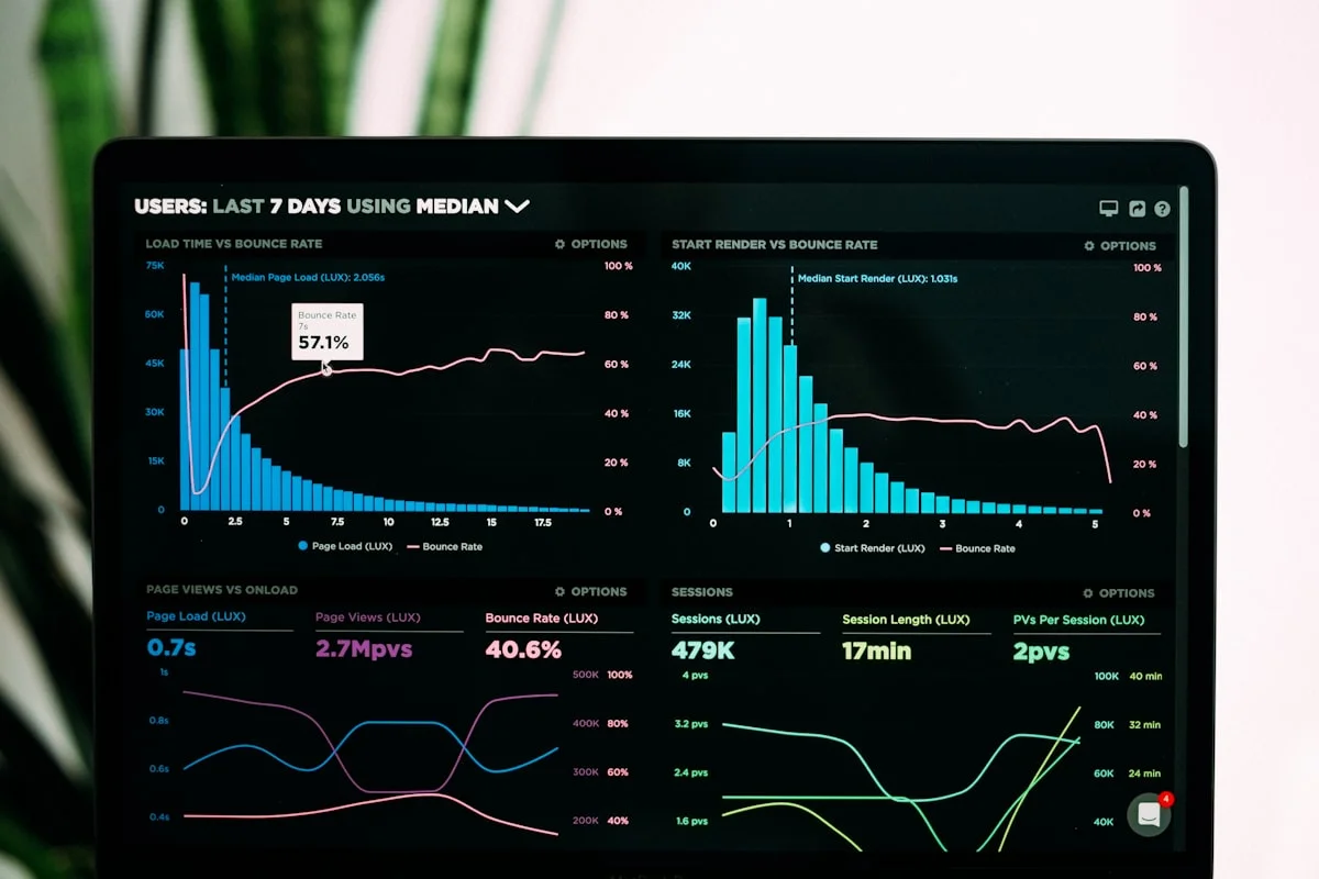
What Is an Employee Productivity KPI Dashboard?
An employee productivity KPI dashboard is a visual reporting interface that consolidates workforce performance metrics into a single view. The dashboard pulls data from time tracking systems, activity monitors, and project management tools to present real-time indicators of how productively teams operate.
Unlike static reports generated weekly or monthly, a productivity dashboard updates continuously. Managers see live data on active work hours, application usage patterns, task completion velocity, and idle time percentages. This real-time capability transforms productivity management from reactive (reviewing last month's numbers) to proactive (adjusting workloads today based on current data).
But what specific components separate an effective KPI dashboard from a cluttered data dump?
An effective employee productivity KPI dashboard contains three layers: leading indicators (metrics that predict future productivity, like focus time trends), lagging indicators (metrics that confirm past performance, like task completion rates), and contextual data (information that explains why numbers moved, like meeting load or tool usage patterns). Dashboards that include all three layers give managers the complete picture needed for informed action.
The 8 Core KPIs Every Productivity Dashboard Needs
Every employee productivity KPI dashboard template starts with a common set of universal metrics. These eight KPIs apply across industries, team sizes, and work models. The specific benchmarks differ by sector (covered in the industry templates below), but the metrics themselves are consistent.
1. Active Work Time Ratio
Definition: Total hours of active, focused work divided by total logged work hours. This metric separates genuine productive effort from time spent idle, in non-work applications, or away from the workstation.
Benchmark range: 65-85% depending on role complexity. A data entry specialist may reach 85%. A software engineer working on complex architecture problems, where thinking time is productive but not captured as "active," typically benchmarks at 65-70%.
Why it matters: Active work time ratio is the single most predictive metric for team output. A Gallup study of 112,000 business units found that teams in the top quartile of engagement (a proxy for active work commitment) achieved 21% higher profitability.
2. Task Throughput Rate
Definition: Number of tasks or deliverables completed per employee per time period (day, week, or sprint).
Benchmark range: Varies by function. BPO agents process 40-60 tickets per day. Software developers close 8-15 story points per sprint. Accounting staff process 150-200 transactions per day.
Why it matters: Throughput rate is the output metric that directly connects to business results. When combined with quality rate, it gives the clearest measure of actual productivity.
3. Idle Time Percentage
Definition: Time during logged work hours where no keyboard, mouse, or application activity is detected, expressed as a percentage of total work time.
Benchmark range: 5-15% is typical. Below 5% may indicate burnout risk (no breaks). Above 20% signals disengagement or process bottlenecks. Context matters: waiting for client approvals or code reviews is not the same as browsing social media.
Why it matters: Excessive idle time costs organizations an estimated $100 billion annually in the United States alone (Bureau of Labor Statistics productivity data). Tracking idle time helps managers identify whether the cause is behavioral, structural, or workflow-related.
4. Productive vs. Non-Productive Application Usage
Definition: Time spent in applications classified as productive (project tools, communication platforms, industry-specific software) versus non-productive (social media, entertainment, personal browsing).
Benchmark range: 80-90% productive application time during core work hours. Some non-productive time is normal and healthy; zero tolerance policies backfire by increasing stress.
Why it matters: Application usage data reveals where time actually goes. RescueTime's analysis of 185 million hours of work data found that the average knowledge worker spends only 2 hours 48 minutes productively in an 8-hour day. Tracking app usage identifies the specific sources of lost time.
5. Meeting Load Ratio
Definition: Percentage of work hours spent in meetings versus individual work. Tracked through calendar integration or application-level monitoring (time spent in Zoom, Teams, Google Meet).
Benchmark range: 15-30% for individual contributors. 30-50% for managers. Above 50% for anyone is a red flag. Atlassian research shows employees spend 31 hours per month in unproductive meetings.
Why it matters: Meeting overload is the leading cause of "shallow work" days where employees attend back-to-back meetings and have no contiguous time for focused output. Tracking this metric helps leadership set meeting budgets per role.
6. Overtime Frequency
Definition: Number of days per month an employee works beyond scheduled hours. Tracked automatically through clock-in and clock-out data.
Benchmark range: 2-4 overtime days per month is within normal range for most roles. More than 8 overtime days per month signals unsustainable workload. The World Health Organization linked regular overtime (55+ hours per week) to a 35% higher risk of stroke.
Why it matters: Consistent overtime is a leading indicator of burnout and eventual attrition. Catching overtime trends early allows managers to redistribute work before employees disengage or leave.
7. Response and Resolution Time
Definition: Average time between receiving a task, ticket, or request and completing it. Applies to support teams, development teams, and any role with defined request-response workflows.
Benchmark range: Highly role-dependent. First response time for support tickets: under 1 hour for priority-one issues. Development bug resolution: 2-5 business days for non-critical issues. The key is establishing baselines for your team and measuring trends.
8. Quality Rate (Rework Percentage)
Definition: Percentage of completed work that requires revision, correction, or rework. Measured through project management tools, QA systems, or client feedback loops.
Benchmark range: Below 5% rework rate is excellent. 5-10% is typical. Above 15% indicates training gaps, unclear requirements, or unrealistic timelines. The American Society for Quality estimates that poor quality costs organizations 15-20% of revenue.
These eight KPIs form the foundation of any employee productivity KPI dashboard template. The next step is configuring them for your specific industry, because a BPO operation and a software development team measure productivity through very different lenses.
Team Productivity — This Week
Productive hours / day
Activity mix
▲ Deep-focus time up 19% after protecting daily focus blocks.
Illustrative eMonitor dashboard.
Employee Productivity KPI Dashboard Template for BPO Teams
Business process outsourcing operations run on volume, speed, and accuracy. A BPO productivity dashboard template emphasizes throughput metrics and agent-level performance visibility because even small efficiency gains multiply across hundreds of agents.
Primary KPIs for BPO Dashboards
- Agent utilization rate: Target 78-85%. NASSCOM's 2025 BPO benchmark report places top-performing Indian BPOs at 83% average utilization. Below 75% indicates scheduling gaps or excessive idle time between calls.
- Average handle time (AHT): The standard metric for call and ticket resolution speed. Industry average is 6-8 minutes per interaction. Track this at agent level and team level to identify coaching opportunities.
- First call resolution (FCR): Percentage of issues resolved without escalation or callback. Target: 70-75%. MetricNet research shows that every 1% improvement in FCR reduces operating costs by 1%.
- Active screen time ratio: Percentage of shift spent actively working in operational applications (CRM, ticketing system, knowledge base) versus idle or in non-work applications. Target: 80-88%.
- Break compliance: Whether agents take scheduled breaks on time and return punctually. Critical for HIPAA-regulated healthcare BPOs and PCI-compliant financial services operations.
- Shift adherence: Percentage of scheduled shift actually worked. Target: 95%+. Measures late logins, early logoffs, and unscheduled absences.
BPO Dashboard Configuration Notes
BPO dashboards require real-time views refreshed every 60 seconds, not hourly or daily summaries. Floor managers need live visibility into agent status (active, idle, on break, away) to manage staffing in real time. A 250-seat BPO operation that reduces average idle time by 3 minutes per agent per shift recovers 12,500 productive minutes daily, equivalent to roughly 26 additional full-time agents.
Configure alert thresholds at two levels: amber (warning) when utilization drops below 75% for any 30-minute window, and red (action required) when it drops below 65%. These thresholds allow floor managers to intervene before productivity losses compound across the shift.
KPI Tracking Dashboard for IT Services and Software Teams
IT services and software development teams measure productivity differently than volume-driven operations. Output is less predictable, deep focus time is critical, and the relationship between "hours worked" and "value created" is non-linear.
Primary KPIs for IT and Software Dashboards
- Focus time ratio: Hours of uninterrupted work (90+ minute blocks with no meetings, chat interruptions, or context switches) divided by total work hours. Target: 40-55% for developers. Microsoft's Work Trend Index found that employees with at least 2 hours of daily focus time report 82% higher satisfaction with their workday.
- Sprint velocity: Story points or task units completed per sprint. Track rolling averages over 4-6 sprints to establish reliable baselines. Velocity trending downward for 3+ consecutive sprints signals process problems or team burnout.
- Code review turnaround: Average time between code submission and review completion. Target: under 24 hours for non-urgent reviews. Google's engineering research shows that reviews completed within 24 hours have significantly lower defect rates.
- Deployment frequency: Number of production deployments per week. Higher frequency correlates with higher team performance (DORA metrics). Elite teams deploy multiple times per day; low performers deploy monthly.
- Context switching frequency: Number of times per hour an employee switches between applications or task categories. Target: fewer than 6 switches per hour during focus blocks. The American Psychological Association estimates context switching costs 40% of productive time.
- Development tool vs. non-development tool ratio: Time in IDE, terminal, and development-related tools versus email, chat, and meetings. Target: 60-70% development tool time for individual contributors.
IT Dashboard Configuration Notes
Software teams resist dashboards that feel like surveillance. The most effective approach is making dashboards team-visible rather than manager-only. When the entire team sees sprint velocity, focus time trends, and meeting load data, the dashboard becomes a shared tool for protecting productive time rather than a management weapon.
Configure weekly and sprint-level views rather than daily granularity. Daily fluctuations in developer productivity are normal (a day spent debugging produces no visible output but may prevent a week of downtime). Sprint-level trends are far more meaningful for engineering managers.
Workforce Productivity Metrics Template for Healthcare Administration
Healthcare administrative teams operate under compliance constraints that add layers of complexity to productivity tracking. HIPAA requirements mean that certain metrics must be tracked for regulatory reasons, not just operational improvement.
Primary KPIs for Healthcare Admin Dashboards
- Claims processing rate: Number of insurance claims processed per staff member per day. Industry benchmark: 25-40 claims per day for manual processing, 80-120 for partially automated workflows (MGMA data).
- Denial rate: Percentage of submitted claims denied by payers. Target: below 5%. The average denial rate across US healthcare organizations is 5-10%, costing an estimated $262 billion annually in rework and lost revenue (Change Healthcare).
- Patient scheduling efficiency: Appointments scheduled per staff member per hour. Target: 8-12 appointments per hour. Track alongside no-show rates to measure scheduling quality, not just volume.
- EHR active time: Time spent actively working in electronic health record systems versus total logged time. Healthcare admin staff average 4-5 hours per day in EHR systems; the remainder splits between phone calls, patient interactions, and administrative tasks.
- Compliance training completion: Percentage of required HIPAA, OSHA, and state-specific training modules completed on time. Target: 100% within 30 days of due date. Non-compliance creates legal risk regardless of productivity output.
- Authorization turnaround: Average time to process prior authorizations. CMS benchmarks target 72 hours for standard requests and 24 hours for urgent requests.
Healthcare Dashboard Configuration Notes
Healthcare dashboards must include access audit logs. Every dashboard view that displays patient-adjacent data needs to record who accessed it, when, and why. This is not optional; it is a HIPAA requirement under the Security Rule (45 CFR 164.312). Configure role-based access so that only authorized managers see individual performance data, and aggregate team-level data for broader leadership views.
Alert thresholds in healthcare should include both productivity and compliance triggers. A claims processor whose denial rate suddenly spikes from 4% to 12% needs coaching, not discipline. A staff member who repeatedly accesses patient records outside their assigned department needs an immediate compliance review.
Employee Productivity KPI Dashboard Template for Finance and Accounting
Finance and accounting teams balance volume processing with absolute accuracy requirements. A productivity dashboard for finance must weight quality metrics as heavily as speed metrics, because a fast but error-prone accountant creates more cost than a slower, precise one.
Primary KPIs for Finance Dashboards
- Transaction processing rate: Number of transactions (invoices, journal entries, reconciliations) processed per staff member per day. Benchmark: 150-250 transactions per day for accounts payable. Top-quartile teams process 300+ (APQC benchmarking data).
- Error rate: Percentage of transactions requiring correction after initial processing. Target: below 0.5% for high-volume processing, below 0.1% for critical entries. The Institute of Management Accountants reports that manual accounting errors cost organizations an average of $878 per error to identify and correct.
- Close cycle time: Days required to complete month-end, quarter-end, and year-end close processes. Top-performing finance teams close in 4-5 days; the average is 6-10 days (Ventana Research). Track close cycle time as a team-level KPI, not individual.
- Reconciliation completion rate: Percentage of account reconciliations completed on schedule. Target: 100% by the third business day post-close. Track both completion percentage and exception counts per reconciliation.
- Tool proficiency ratio: Time spent in core financial applications (ERP, accounting software, Excel) versus non-core applications. Target: 75-85% core tool time during close periods, 65-75% during normal operations.
- Audit finding rate: Number of internal or external audit findings per review period. This is a lagging indicator that validates whether your productivity gains are maintaining quality standards.
Finance Dashboard Configuration Notes
Finance dashboards need period-specific views. During month-end close, the dashboard should shift to a close-specific layout showing checklist completion, outstanding reconciliations, and bottleneck identification. During normal operations, the standard productivity template applies. Configure automatic view switching based on calendar proximity to close dates.
Segregation of duties requirements affect dashboard access. A staff accountant who processes journal entries and the manager who approves them should not have identical dashboard views. The manager needs approval queue visibility; the staff accountant needs personal throughput and accuracy data.

See Your Team's Productivity KPIs in Real Time
eMonitor tracks active work time, application usage, idle time, and task patterns automatically. Pre-built dashboards configured for your industry. Start a free trial today.
Team Productivity Scorecard Template for Retail Operations
Retail operations productivity involves a mix of digital and physical tasks. The dashboard template for retail back-office and corporate teams differs from store-level operations, but both share a focus on seasonal responsiveness and labor cost optimization.
Primary KPIs for Retail Corporate and Back-Office Dashboards
- Order processing rate: Number of orders processed per staff member per hour. E-commerce fulfillment benchmarks: 15-25 orders per hour for manual picking, 40-60 for automated systems (Logistics Bureau).
- Inventory accuracy rate: Percentage of SKUs where system count matches physical count. Target: 97%+ for retail operations. The National Retail Federation estimates inventory shrinkage costs US retailers $112 billion annually.
- Vendor response time: Average time to process purchase orders, respond to vendor inquiries, and resolve discrepancies. Track this metric to identify procurement team bottlenecks.
- Seasonal readiness index: A composite metric tracking preparation milestones (merchandising plans, staffing schedules, inventory levels) against target dates. Retail teams that miss seasonal preparation windows lose an estimated 15-20% of potential seasonal revenue (Deloitte Retail).
- Returns processing time: Average time from return receipt to credit issuance or exchange completion. Benchmark: under 48 hours for standard returns. Faster returns processing directly correlates with customer satisfaction scores.
Retail Dashboard Configuration Notes
Retail dashboards need seasonal overlay capability. The same team operates under fundamentally different conditions during Black Friday week versus a quiet February. Configure benchmarks with seasonal adjustment factors: expect 15-25% lower per-unit processing time during peak seasons (higher volume creates economies of scale) but allow for 10-15% higher error rates under peak pressure.
How to Build a Productivity KPI Dashboard: 6-Step Implementation Guide
Selecting the right KPIs is only half the challenge. Implementation determines whether a productivity dashboard becomes a daily management tool or an unused report. These six steps apply regardless of which industry template you adopt.
Step 1: Define Your Measurement Objectives
Start by answering one question: "What management decisions will this dashboard support?" Common objectives include workload redistribution (do we need to hire or reallocate?), performance coaching (who needs support and in what area?), process optimization (where are bottlenecks slowing everyone down?), and capacity planning (can we take on more client work with current headcount?).
Each objective maps to different KPIs. A dashboard built for coaching requires individual-level data with trend lines. A dashboard built for capacity planning needs team-level utilization data with forecasting capability. Trying to serve all objectives in one view creates clutter. Build separate dashboard views for separate audiences.
Step 2: Select 5-8 Primary Metrics
Resist the temptation to track everything. Research from the Performance Measurement Association shows that dashboards with more than 10 metrics suffer from attention dilution: managers glance at the dashboard but take no action because the signal-to-noise ratio is too low.
Select 5-8 metrics using this framework: 2-3 leading indicators (predictive), 2-3 lagging indicators (confirmatory), and 1-2 contextual metrics (explanatory). The industry templates above provide starting selections. Customize based on your specific objectives from Step 1.
Step 3: Establish Baseline Measurements
Before setting targets, measure where you are today. Run your productivity tracking tool for 2-4 weeks without communicating targets to the team. This baseline period captures authentic work patterns before the "observation effect" (also known as the Hawthorne effect) changes behavior.
Record baseline averages and standard deviations for each metric. A team with an average utilization rate of 68% and a standard deviation of 12% has high variability. Setting a target of 80% without addressing the variability root cause will frustrate the team.
Step 4: Set Tiered Targets
Use three tiers instead of a single target number. Minimum acceptable (below this triggers investigation), target (the performance level you are managing toward), and stretch (aspirational, achievable by top performers). This framework prevents the demoralization that occurs when a single target feels unattainable and creates natural coaching conversations around moving from minimum to target, or target to stretch.
Step 5: Configure Automated Data Collection
Manual data entry for dashboards defeats the purpose. If employees must manually log their productivity metrics, the data is unreliable and the overhead reduces the very productivity you are trying to measure. Automated collection through a time tracking and activity monitoring platform eliminates both problems.
eMonitor's desktop agent captures active work time, application usage, idle time, and task transitions automatically. The data feeds directly into pre-configured dashboard views. Setup takes approximately 10 minutes per workstation, and data collection begins immediately with no employee workflow changes required.
Step 6: Create a Review Cadence
A dashboard without a review rhythm is a decoration. Establish three review frequencies: daily (5-minute check by team leads for operational anomalies), weekly (15-minute team review of trend data with action items), and monthly (30-minute strategic review with leadership covering capacity, hiring, and process changes).
Document actions taken based on dashboard data. A Bain and Company study found that organizations with documented "data to action" workflows achieve 6% higher productivity growth annually compared to those that collect data without structured decision-making processes.
5 Mistakes That Make Productivity KPI Dashboards Fail
Most productivity dashboards fail not because the data is wrong, but because the design, communication, or implementation undermines adoption. Recognizing these patterns prevents the most common failure modes.
Mistake 1: Tracking Inputs Instead of Outputs
A dashboard that measures hours logged, keystrokes per minute, and mouse movements creates a perverse incentive: employees optimize for "looking busy" rather than producing results. A developer who spends two hours thinking through an architecture decision and then writes 50 lines of clean code is more productive than one who writes 500 lines of messy code requiring refactoring. Track task completion, quality rate, and business outcomes. Use activity data as context, not as the primary score.
Mistake 2: Setting Identical Targets Across Different Roles
A content writer and a data analyst both use computers all day, but their productive patterns are completely different. Writers have long stretches of focused typing. Analysts alternate between coding, visualization, and stakeholder communication. Applying the same "75% active time" target to both roles penalizes the analyst for the communication that makes their work valuable. Create role-specific benchmark groups.
Mistake 3: Hiding the Dashboard From Employees
Manager-only dashboards breed distrust. When employees cannot see their own metrics, they assume the worst about how data is being used. Making productivity data transparent gives employees ownership of their improvement. Self-directed improvement is more sustainable than externally imposed targets. Organizations with transparent performance data report 14% higher engagement scores (Deloitte Human Capital Trends, 2025).
Mistake 4: Ignoring Contextual Factors
Productivity drops during a major system migration are expected, not a performance problem. Utilization dips during onboarding reflect learning curves, not laziness. A dashboard without contextual annotations generates false alarms that erode management trust in the data. Build in the ability to tag periods with context (system outage, training week, holiday season) so that trend analysis reflects genuine performance changes.
Mistake 5: No Action Workflow
Data without action is just reporting. Every KPI on the dashboard needs a defined response protocol. If utilization drops below the minimum threshold for three consecutive days, what happens? Who investigates? What is the escalation path? Without these workflows, dashboards become expensive screensavers.
Advanced Dashboard Configurations for Multi-Site and Remote Teams
Organizations with distributed teams face additional dashboard complexity. A 500-person company with offices in New York, London, and Bangalore operates across three time zones, two compliance frameworks (GDPR and US state laws), and three different labor cultures. The employee productivity KPI dashboard template must account for these differences.
Time Zone Normalization
Display all dashboard data in the viewer's local time zone by default, with the option to switch to UTC or the employee's local time zone. This prevents the confusion where a manager in New York sees a Bangalore employee's "low productivity" at 2 PM EST without realizing it is 11:30 PM IST and the employee's shift ended hours ago.
Regional Benchmark Adjustment
Productivity benchmarks vary by region due to cultural norms, labor laws, and infrastructure differences. European teams with mandated lunch breaks and stricter overtime regulations produce different utilization patterns than US teams with flexible schedules. Rather than applying a single global benchmark, configure regional baseline periods and set targets relative to each region's baseline.
Remote vs. In-Office Composite Views
Remote employees and in-office employees produce different activity patterns even when their output is identical. Remote workers typically log in earlier, take shorter lunch breaks, and show more evening activity. In-office workers show higher meeting loads and more collaborative tool usage. A well-configured dashboard normalizes for these patterns rather than penalizing either group for their work style.
eMonitor's reporting system supports multi-location dashboards with automatic time zone normalization and role-based views. Remote and in-office teams appear on a unified dashboard with location tags, letting managers compare output without penalizing location-specific patterns.
Measuring the ROI of Your Productivity KPI Dashboard
Implementing a productivity dashboard has costs: software licensing, setup time, management training, and ongoing review time. Measuring return on investment validates the investment and guides future optimization.
Direct Cost Savings
Track three direct savings categories. Reduced overtime costs: organizations using productivity dashboards report 15-25% reductions in unplanned overtime within 90 days (Gartner). Improved capacity utilization: identifying underutilized team members and redistributing work reduces the need for new hires. A 5% utilization improvement across a 100-person team is equivalent to hiring 5 additional staff. Reduced attrition costs: catching burnout indicators early prevents turnover. The Society for Human Resource Management estimates the average cost to replace a salaried employee at 6-9 months of their salary.
Indirect Productivity Gains
Faster decision-making is the largest indirect benefit. Without a dashboard, identifying a workload imbalance requires pulling reports, scheduling meetings, and analyzing data manually. With a dashboard, the same insight is visible in seconds. McKinsey research shows that data-driven organizations are 23 times more likely to acquire customers, 6 times more likely to retain them, and 19 times more likely to be profitable.
Calculating Your Specific ROI
Use this formula: (Annual savings from reduced overtime + value of recovered productive hours + avoided hiring costs + avoided attrition costs) minus (software cost + implementation time cost + ongoing management time cost) = Net dashboard ROI.
For a 100-person team using eMonitor at $4.50 per user per month ($5,400 annually), even a modest 3% productivity improvement on an average salary of $55,000 translates to $165,000 in recovered productive value. That is a 30:1 return on the software investment alone.
Build Your KPI Dashboard in Under 10 Minutes
eMonitor captures every metric covered in this guide automatically. No manual data entry. No complex configuration. Pre-built views for BPO, IT, healthcare, finance, and remote teams. Start your free trial and see your team's productivity data within the first hour.
Frequently Asked Questions About Productivity KPI Dashboards
What KPIs should be on a productivity dashboard?
A productivity KPI dashboard includes active work time ratio, task throughput rate, idle time percentage, productive vs. non-productive application usage, meeting load, overtime frequency, response time, and quality rate. eMonitor tracks the first four automatically through its desktop agent, with data feeding directly into pre-configured dashboard views.
How do you build a productivity KPI dashboard?
Building a productivity KPI dashboard requires six steps: define measurement objectives, select 5-8 primary metrics, establish baseline measurements over 2-4 weeks, set tiered targets (minimum, target, stretch), configure automated data collection, and create a review cadence. eMonitor provides pre-built templates that compress this process to under 10 minutes.
What are productivity benchmarks by industry?
Productivity benchmarks differ substantially by industry. BPO operations target 78-85% agent utilization. IT services teams benchmark at 65-75% productive time with 40-55% focus time. Healthcare admin targets 25-40 claims processed daily. Finance teams process 150-250 transactions per day with error rates below 0.5%. These benchmarks draw from NASSCOM, MGMA, and APQC research.
Which metrics matter most for employee productivity?
The three most predictive productivity metrics are active work time ratio, task throughput rate, and quality rate (rework percentage). Active work time measures effort intensity. Throughput measures output volume. Quality rate ensures output meets standards. eMonitor captures the first two automatically, while quality rate integrates through project management tool data.
How often should you review a productivity KPI dashboard?
Review productivity dashboards at three frequencies: daily (5-minute operational checks by team leads), weekly (15-minute trend reviews with the team), and monthly (30-minute strategic reviews with leadership). eMonitor sends automated weekly summary reports to reduce the time managers spend on manual dashboard review.
What is the difference between a KPI dashboard and a scorecard?
A KPI dashboard displays real-time operational metrics for daily decisions. A scorecard compares actual performance against predefined targets over a fixed period, typically monthly or quarterly. eMonitor functions as both: the live dashboard supports daily management while configurable reports serve as periodic performance scorecards.
Can small teams benefit from a productivity KPI dashboard?
Small teams benefit disproportionately from KPI dashboards. In a 10-person team, one underperforming member reduces total output by 10%. A productivity dashboard surfaces these gaps immediately. eMonitor starts at $4.50 per user per month with no minimum team size, making structured productivity tracking accessible at any scale.
How do you avoid making a productivity dashboard feel like surveillance?
Share the dashboard with employees so they see their own data. Focus on outcomes (tasks completed, projects delivered) rather than inputs (keystrokes, mouse clicks). Set benchmarks collaboratively. eMonitor's employee-facing dashboard gives every team member visibility into personal metrics, framing productivity tracking as a self-improvement tool rather than oversight.
What tools integrate with productivity KPI dashboards?
Effective productivity dashboards pull data from time tracking software, project management platforms (Jira, Asana), communication tools (Slack, Teams), and HR systems. eMonitor captures time, activity, and productivity data natively. Dashboard data exports to CSV and PDF for integration with BI platforms like Power BI, Tableau, and Google Looker Studio.
Should remote and in-office employees have different dashboard KPIs?
Core KPIs (active work time, task throughput, quality rate) remain identical regardless of location. Contextual patterns differ: remote employees often log in earlier and show more evening activity. eMonitor normalizes data across locations, allowing managers to compare output equally without penalizing employees for location-specific work patterns.
Start Measuring What Matters: Your Productivity KPI Dashboard Template Checklist
An employee productivity KPI dashboard template transforms scattered data into structured decisions. The templates in this guide cover the five highest-demand industries (BPO, IT services, healthcare, finance, and retail), but the underlying principles apply to any team: measure 5-8 metrics that connect to business outcomes, set tiered targets based on real baselines, automate data collection, and review on a consistent cadence.
The difference between teams that improve productivity and teams that just talk about it comes down to measurement discipline. A Bain and Company analysis found that top-quartile companies in operational decision-making are 95% more likely to have structured performance dashboards than bottom-quartile companies.
Whether you build your employee productivity KPI dashboard template from scratch or deploy pre-configured views from a platform like eMonitor, the most important step is the first one: start collecting data today. Every week without baseline measurements is a week without the foundation for informed improvement.
Deploy Your Productivity Dashboard Today
eMonitor installs in under 2 minutes, captures productivity data automatically, and provides pre-built KPI dashboards by industry. No manual configuration required. Join 1,000+ companies already tracking what matters.
Sources
- McKinsey Global Institute, "The Age of Analytics: Competing in a Data-Driven World"
- Gallup, "State of the Global Workplace Report," 2025
- RescueTime, "Productive Time Analysis: 185 Million Hours of Work Data"
- Bureau of Labor Statistics, US Productivity Data, 2025
- NASSCOM, "India BPO Benchmark Report," 2025
- MetricNet, "First Call Resolution Impact Study"
- Microsoft Work Trend Index, 2025
- DORA (DevOps Research and Assessment), "Accelerate State of DevOps," 2025
- American Psychological Association, "Context Switching and Cognitive Load"
- MGMA (Medical Group Management Association), "Practice Operations Report"
- Change Healthcare, "Revenue Cycle Management Index," 2025
- American Society for Quality, "Cost of Poor Quality"
- APQC (American Productivity and Quality Center), "Finance Benchmarking"
- Institute of Management Accountants, "Cost of Accounting Errors Study"
- Ventana Research, "Finance Close Benchmark Study"
- National Retail Federation, "National Retail Security Survey," 2025
- Deloitte, "Human Capital Trends," 2025
- Deloitte Retail, "Holiday Retail Survey," 2025
- Gartner, "Workforce Productivity and Management Technology"
- World Health Organization, "Long Working Hours and Health Risks"
- Society for Human Resource Management, "Cost of Employee Turnover"
- Bain and Company, "Data-Driven Decision Making Impact"
- Atlassian, "State of Meetings Report"
- Google Engineering Practices, "Code Review Turnaround"
- Performance Measurement Association, "Dashboard Design Best Practices"
- Logistics Bureau, "Warehouse Productivity Benchmarks"