Reporting & Dashboards
Employee Monitoring Dashboards and Reports for Data-Driven Decisions
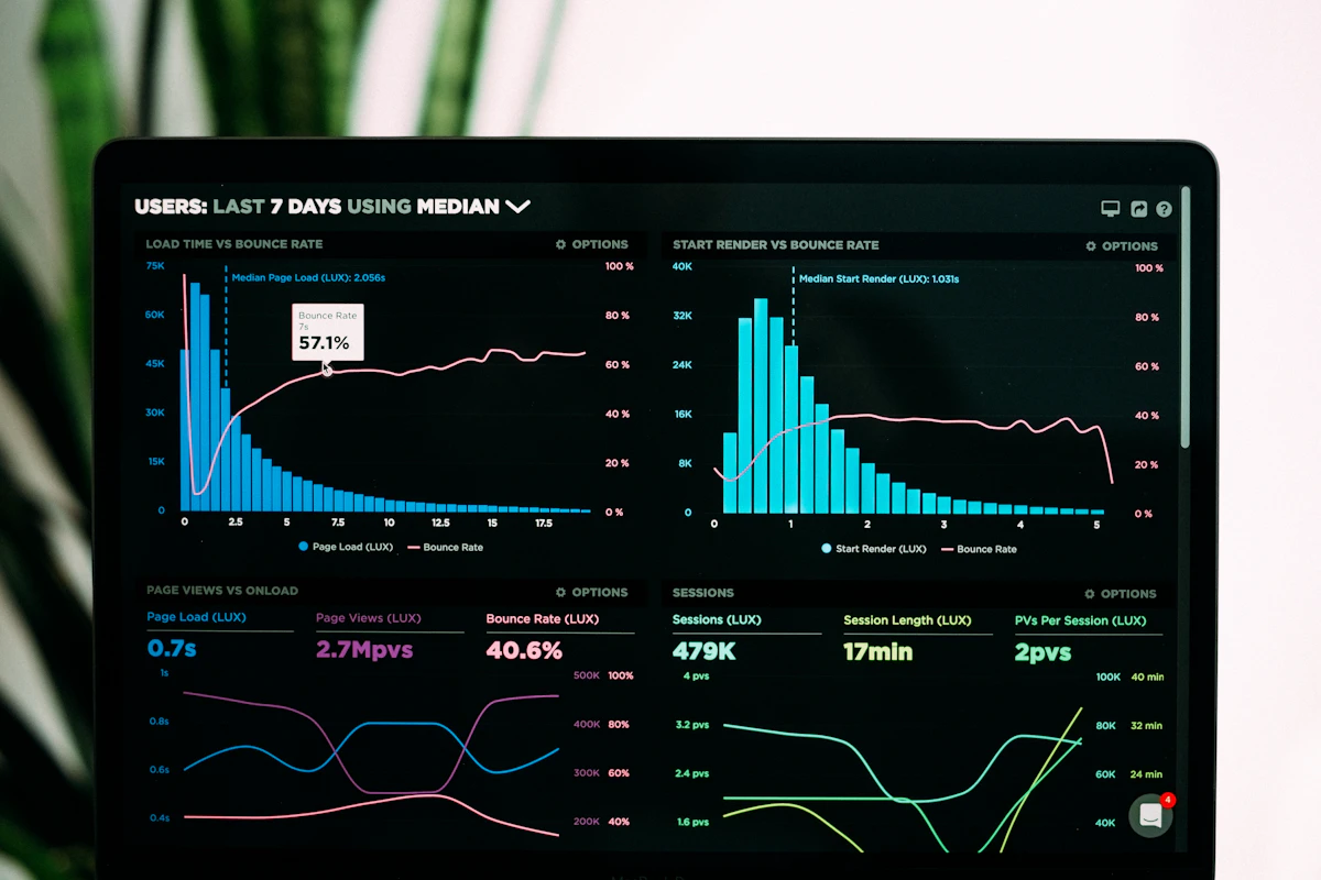
Raw data is useless without interpretation. eMonitor transforms monitoring data into visual dashboards and exportable reports that tell you what's happening, why it matters, and what to do about it.
7-day free trial. No credit card required.
Reports for Every Stakeholder
Time & Attendance Reports
Hours worked, late arrivals, absences, overtime, and break compliance. Export-ready for payroll processing and HR audits.
Productivity Reports
Individual and team productivity scores, active time, focus time, and productive/unproductive time ratios with trend analysis.
App & Website Reports
Top applications by usage time, most visited websites, category breakdowns, and productive vs unproductive time distribution.
Team Comparison Reports
Compare productivity, attendance, and activity metrics across teams and departments. Identify high performers and teams that may need support.
Alert & Incident Reports
History of all triggered alerts with resolution status. Identify recurring issues and measure policy compliance over time.
Custom Reports
Build reports with exactly the metrics you need. Filter by date, team, individual, or activity type. Save templates for recurring use.
Your Command Center: The Live Dashboard
The eMonitor dashboard gives you a real-time overview of your entire workforce in one screen:
- Live team status — See who's active, idle, on break, or offline right now.
- Today's productivity snapshot — Productive time percentage, top apps, and attendance summary updated in real time.
- Trend indicators — Arrows showing whether key metrics are improving or declining compared to the previous period.
- Recent alerts — The latest triggered alerts with one-click access to details.
- Customizable widgets — Drag, drop, and resize to build the view that matches your priorities (Professional/Enterprise).
Types of Reports and What Each Reveals
Every report in eMonitor is designed to answer specific management questions. Understanding what each report reveals helps you choose the right data for the decision at hand:
- Time and attendance report — Shows clock-in times, clock-out times, total hours worked, late arrivals, early departures, absences, overtime hours, and break durations for each employee. This report answers: "Are people working their scheduled hours?" Use it for payroll verification, labor law compliance, and identifying chronic attendance issues. For example, a team lead reviewing this report might discover that 3 out of 12 team members consistently arrive 15-20 minutes late on Mondays, prompting a scheduling adjustment rather than a disciplinary conversation.
- Productivity report — Displays active time versus idle time, productive versus unproductive application usage ratios, focus time blocks, and productivity scores by individual and team. This report answers: "How effectively is work time being used?" A department manager might use this report to discover that their team spends 2.5 hours daily in email and only 3.5 hours in their core work application, leading to a targeted initiative to reduce email overload.
- App and website usage report — Lists every application and website accessed during work hours, ranked by time spent. Categories are labeled as productive, unproductive, or neutral based on your configured rules. This report answers: "What tools are people actually using?" It frequently reveals that teams rely on shadow IT tools not sanctioned by the organization, or that expensive licensed software is barely used.
- Team comparison report — Side-by-side comparison of productivity, attendance, and activity metrics across teams or departments. This report answers: "Which teams are performing well and which need support?" It is especially valuable after organizational changes, when comparing performance before and after a process improvement, or when justifying resource allocation decisions to senior leadership.
- Alert and incident report — Chronological log of all triggered alerts with details on what triggered each alert, when, and the resolution status. This report answers: "Are policies being followed and are incidents being addressed?" Review it weekly to identify recurring patterns that may indicate systemic issues rather than individual violations.
- Custom report — Combine any available metrics with custom filters for date range, team, department, individual, or activity type. Save report templates for recurring use. This answers whatever specific question you need answered, from "How much time did the design team spend in Figma last quarter?" to "Which employees have triggered more than 3 alerts in the past 30 days?"
How to Build Custom Dashboards Step by Step
Custom dashboards on Professional and Enterprise plans allow you to create a personalized command center that displays only the metrics relevant to your role. Here is how to build one:
- Navigate to Dashboard Settings — From any dashboard view, click the gear icon in the top right corner and select "Create New Dashboard." Give it a descriptive name such as "Marketing Team Weekly Overview" or "Executive Summary."
- Add widgets from the widget library — The widget library contains pre-built components including team status (active/idle/offline), productivity score gauges, attendance summaries, top applications charts, alert feeds, and trend line graphs. Drag widgets onto the dashboard canvas.
- Configure each widget — Click any widget to set its data source, scope (entire organization, specific department, or specific team), time range (today, this week, this month, or custom), and display preferences such as chart type, color coding, and threshold markers.
- Arrange and resize — Drag widgets to reposition them and use corner handles to resize. Place your highest-priority metrics at the top left where your eye naturally lands first. Group related metrics together, such as attendance widgets in one row and productivity widgets in another.
- Set as default for your role — Save the dashboard and optionally set it as the default view that loads when you log in. On Enterprise plans, administrators can assign default dashboards to user roles, so every team lead sees the team lead dashboard and every HR manager sees the HR dashboard automatically.
- Share with colleagues — Dashboards can be shared with other users who have appropriate access permissions. Share a read-only link or clone a dashboard template for another manager to customize for their own team.
Most users create their first custom dashboard in under 10 minutes. Start with 4-6 widgets focused on your top priorities, then refine over the first week as you learn which metrics you check most frequently.
Data Visualization Best Practices for Workforce Data
Effective data visualization is the difference between dashboards that drive action and dashboards that get ignored. eMonitor follows these visualization principles to ensure your workforce data is immediately actionable:
- Use trend lines instead of snapshots — A single day's productivity score is meaningless without context. eMonitor defaults to showing 7-day or 30-day trend lines so you can distinguish between a temporary dip and a genuine downward pattern. A team that dropped from 78% to 65% productivity today might be alarming, but a trend line showing they hover between 62-80% every week puts it in context.
- Color code by threshold, not by value — Dashboard widgets use green, amber, and red indicators based on configurable thresholds rather than arbitrary color gradients. This means you instantly see what needs attention without interpreting scales. Set your own thresholds: for example, green above 75% productive time, amber between 60-75%, red below 60%.
- Comparative views over absolute numbers — A team with 6.2 hours of active time is hard to evaluate in isolation. Comparing it against the department average of 6.8 hours or last month's average of 5.9 hours makes the data immediately meaningful. eMonitor's comparison widgets automatically surface these relative insights.
- Drill-down capability — Every chart, graph, and summary widget supports click-to-drill-down. Click a department productivity bar to see team-level breakdown. Click a team to see individual contributors. Click an individual to see their detailed activity log. This progressive disclosure prevents information overload while keeping deep data accessible.
Scheduled Report Automation Workflow
Manual report generation is a task that should not exist in 2026. eMonitor's report scheduling system automates the entire workflow from generation to delivery:
- Create or select a report template — Use any built-in or custom report as the basis for a scheduled delivery. Configure the metrics, filters, scope, and formatting exactly as you want stakeholders to receive it.
- Set the schedule — Choose daily (delivered each morning before work starts), weekly (delivered Monday morning for the previous week), or monthly (delivered on the first business day of each month). Select the delivery time in your preferred time zone.
- Define the recipient list — Add any number of email recipients. For sensitive data, recipients can be restricted to users with appropriate eMonitor access levels, ensuring that a team lead only receives data about their own team even if the report template covers the entire department.
- Choose the format — Reports are delivered as PDF attachments for stakeholders who want to review them visually, or CSV attachments for recipients who will import the data into spreadsheets or other tools for further analysis. Enterprise plans can deliver data via API webhook for automated ingestion into BI platforms.
- Review and activate — Preview the report to confirm it contains the expected data, then activate the schedule. You will receive a confirmation email with the next scheduled delivery date. Schedules can be paused, modified, or deleted at any time.
Common scheduling patterns include a weekly productivity summary for team leads every Monday morning, a monthly attendance report for HR on the first of each month, and a daily alert digest for compliance officers in regulated industries like healthcare.
API Integration for Enterprise BI Tools
For organizations that centralize analytics in tools like Tableau, Power BI, Looker, or a custom data warehouse, eMonitor's Enterprise plan provides REST API access that transforms eMonitor from a standalone tool into a data source within your broader analytics ecosystem:
- Real-time data endpoints — Pull current team status, active session data, and today's productivity metrics for live operational dashboards.
- Historical data endpoints — Query time-series data for any date range with filters by department, team, individual, or metric type. Pagination supports efficient retrieval of large datasets for organizations with thousands of employees.
- Webhook notifications — Receive push notifications when specific events occur (alerts triggered, thresholds breached, reports generated) without needing to poll the API. Integrate with Slack, Microsoft Teams, PagerDuty, or custom notification systems.
- Authentication and rate limiting — API access uses OAuth 2.0 authentication with configurable scopes to ensure that API consumers only access the data they are authorized to see. Rate limits are generous for enterprise clients and can be adjusted based on your integration requirements.
API documentation with interactive examples, SDKs for Python, JavaScript, and C#, and sample integration templates are included in the Enterprise onboarding package.
Role-Based Dashboard Examples
Different roles need different views of the same underlying data. Here is what each stakeholder level typically sees:
- CEO / Executive dashboard — Organization-wide KPIs at a glance: overall workforce productivity percentage, total active headcount, department comparison rankings, month-over-month trend arrows, and cost metrics such as productivity per labor dollar. Executives should see 4-6 widgets maximum. This view answers the question: "Is the organization performing better or worse than last month, and which departments are driving the trend?"
- HR Manager dashboard — Attendance patterns across the organization, absence rates by department, overtime distribution, new hire onboarding progress, and alert summaries for policy violations. HR uses this data for workforce planning, identifying retention risks, and preparing compliance documentation. Links to detailed attendance tracking data allow drill-down when patterns need investigation.
- Team Lead dashboard — Real-time status of every team member (active, idle, on break, offline), today's individual productivity scores, current task or application usage per person, and this week's attendance compliance. This is the most operational view, designed for daily management. Team leads typically check this dashboard 3-5 times per day to stay aware of their team's activity without micromanaging.
- Project Manager dashboard — Time spent per project, team utilization across projects, deadline proximity with actual progress data, and contractor billing summaries for projects that use external resources. This view bridges workforce data with project delivery metrics.
- Compliance Officer dashboard — Alert history, policy violation trends, data access audit logs, and compliance report generation tools. Focused entirely on risk and policy adherence, this dashboard is common in healthcare, finance, and government organizations where regulatory oversight is a daily concern.
Reporting & Dashboards FAQ
What reports does eMonitor generate?
eMonitor generates six core report types: time and attendance reports for payroll and compliance, productivity reports for individual and team performance analysis, app and website usage reports showing tool adoption and time distribution, team comparison reports for cross-department benchmarking, alert and incident reports for policy compliance tracking, and fully custom reports where you define the metrics, filters, and format. All reports can be filtered by date range, team, department, or individual employee.
Can I schedule automatic report delivery?
Yes, on Professional and Enterprise plans. Schedule any report template for automatic generation and email delivery on a daily, weekly, or monthly basis. Define the recipient list, choose PDF or CSV format, and set the delivery time in your preferred time zone. Enterprise plans also support API webhook delivery for automated ingestion into BI platforms. Schedules can be paused, modified, or deleted at any time without affecting the underlying report template.
Can I create custom dashboards?
Yes, on Professional and Enterprise plans. The drag-and-drop dashboard builder lets you select from a library of pre-built widgets (team status, productivity gauges, trend charts, attendance summaries, alert feeds, and more), configure each widget's data source and scope, and arrange them into a personalized layout. Save multiple dashboards for different contexts and set a default that loads automatically. Enterprise administrators can assign default dashboards by role so that every team lead, HR manager, or executive sees the view most relevant to them.
What export formats are supported?
All plans support CSV export for spreadsheet analysis and PDF export for sharing with stakeholders who prefer visual reports. Enterprise plans add REST API access for feeding data directly into external BI tools like Tableau, Power BI, Looker, or custom data warehouses. The API supports both real-time data pulls and historical data queries with pagination for large datasets. Webhook notifications are also available for event-driven integrations.
How far back does report data go?
Data retention depends on your plan and configuration. Starter plans retain detailed data for 30 days and summary data for 6 months. Professional plans retain detailed data for 90 days and summary data for 12 months. Enterprise plans offer configurable retention periods up to 24 months for detailed data, with summary and aggregated data retained indefinitely. Archived data beyond the detailed retention period is available in aggregated form for long-term trend analysis without storing granular activity logs.
Can different managers see different data based on their role?
Yes. eMonitor's role-based access control ensures that each user only sees data they are authorized to view. A team lead sees only their direct reports. A department head sees all teams within their department. HR managers can access organization-wide attendance and compliance data. Executives see aggregated KPIs across the entire organization. These permissions are enforced across dashboards, reports, and API access, so there is no risk of a manager accidentally viewing another team's detailed data.
See how eMonitor compares: Best Monitoring Software 2026 · vs Hubstaff · vs Time Doctor